BRAND REFRESH
During my time at GSW, I worked on an unofficial brand refresh for a global biopharmaceutical company, which I’ll refer to here simply as the brand.
The creative brief outlined key strategic elements of its identity, which I explored and interpreted in my design work.
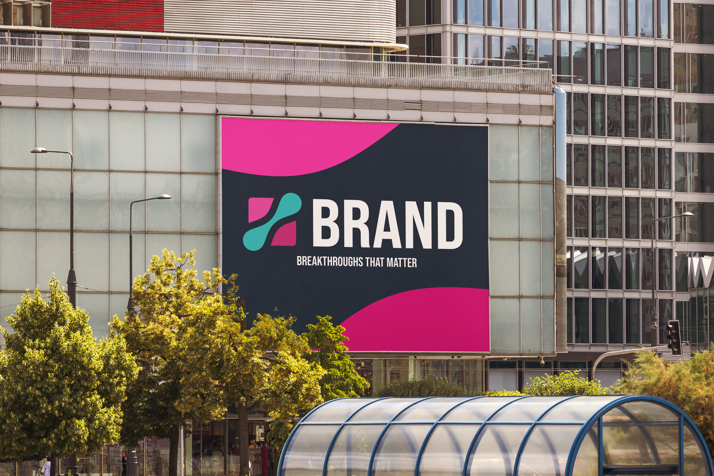
One of the most important themes was “Breakthroughs That Matter”, a dual focus on driving meaningful innovation in oncology, neuroscience, and rare diseases while ensuring every advance has a tangible, positive impact on people’s lives.
I was also fascinated by the brand’s central purpose: “Where Scientific Precision Meets Human Purpose.” Its identity is rooted in advanced science, specialized expertise, and a deeply human, patient-centric mission.
My exploration asked: What does a breakthrough look like? Where does scientific precision meet human focus?
Through this lens, I developed concepts using negative space, energetic bursts, and human-centered forms to capture the tension between rigor and empathy that defines the brand’s vision.

Initial Ideation
CONCEPT 1
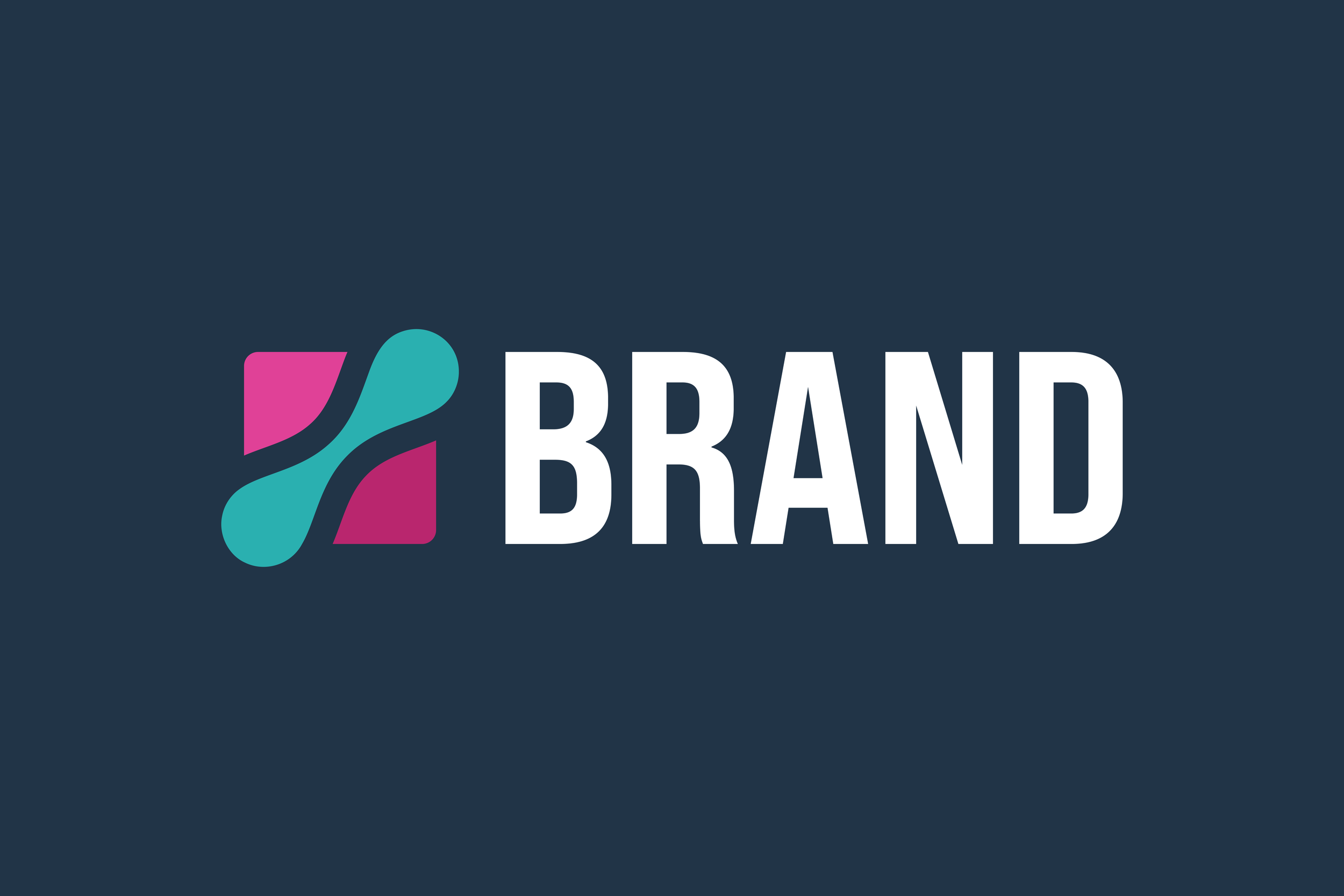
The logo focuses heavily on the concept of BREAKTHROUGH, with a rounded shape expanding through a sharp-edged square. The outer shape represents the scientific precision of the brand’s work, with the organic, expanding shape representing the brand’s human-centric breakthroughs.

CONCEPT 2
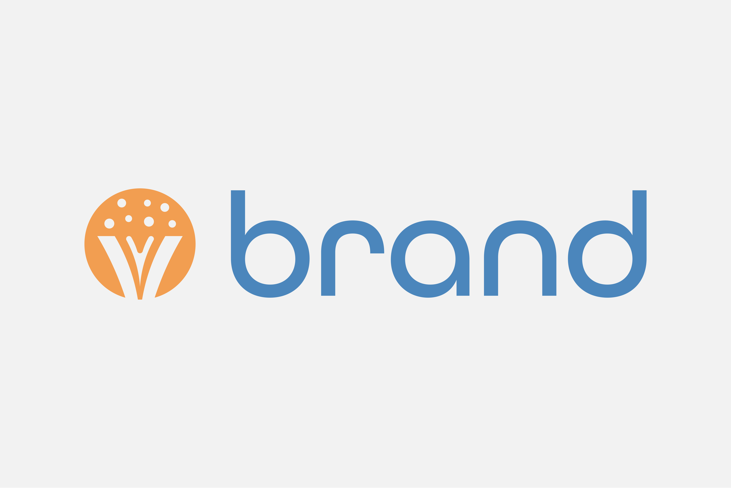
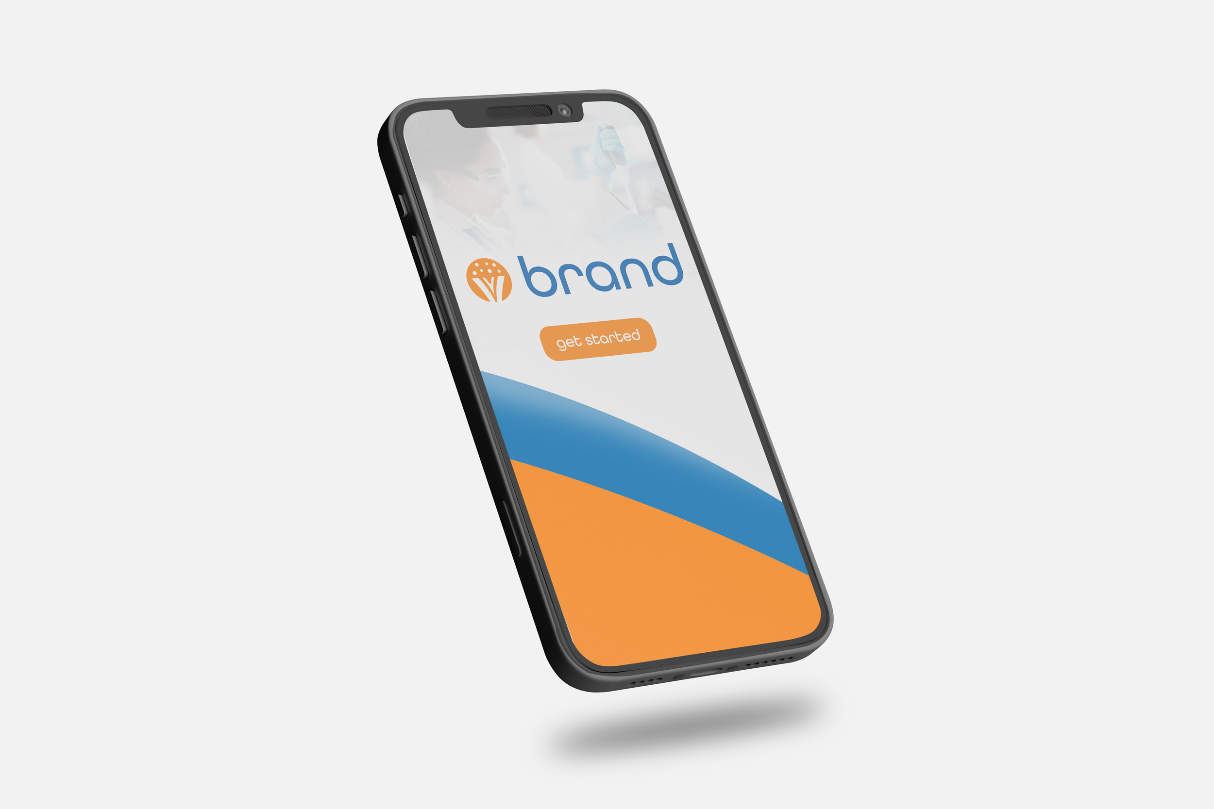
The logo is an elegant telling of the brand’s story. Science, humanity, and technology work in tandem to put life-changing therapies into the world. Here, the outer ”V” shape represents the sharp, scientific precision of the brand, while the soft interior geometry represents its human focus. Small circles emerge from the shape, representing new technologies and innovations being released into the world.

CONCEPT 3
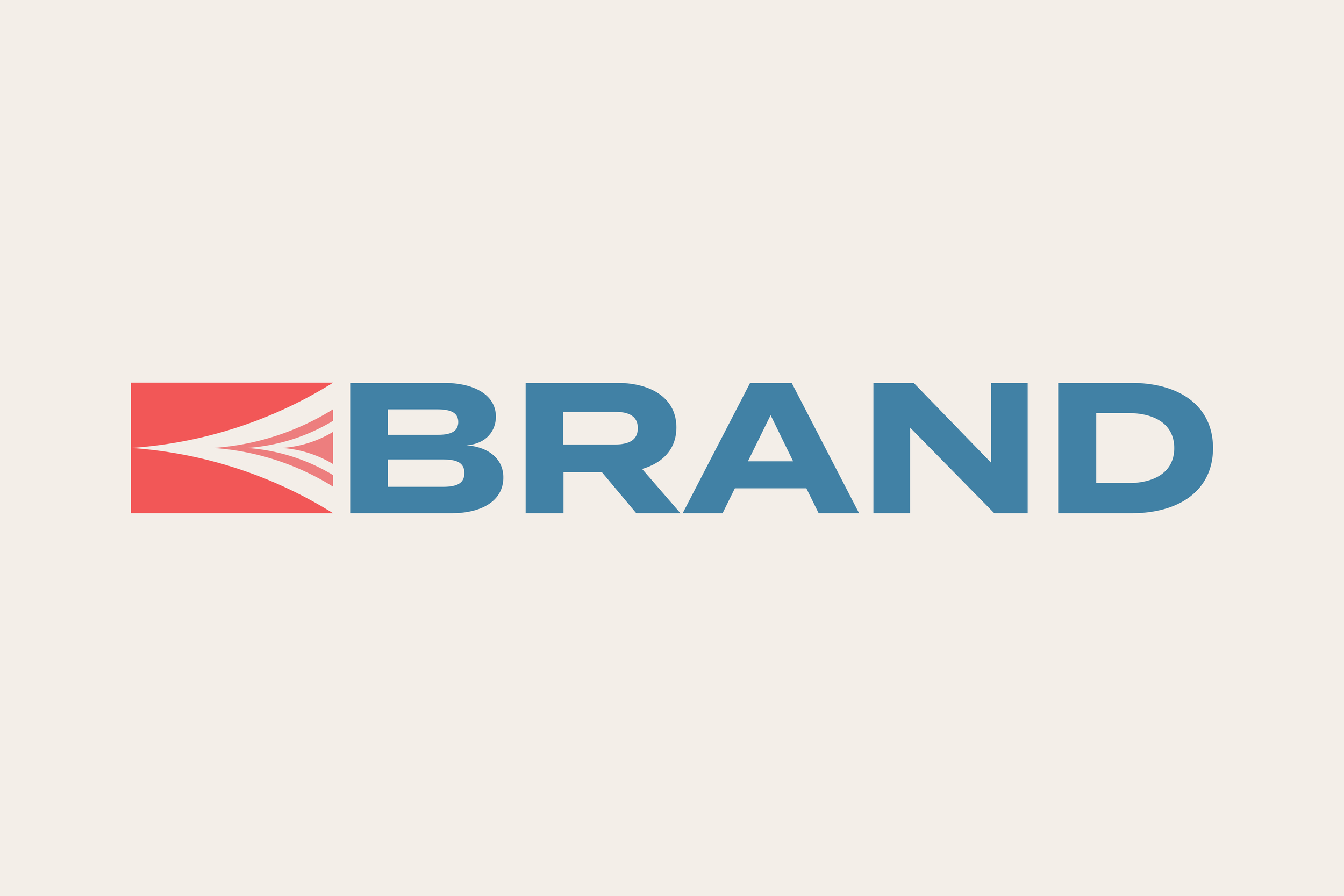
The logo features a sleek “V” shape breaking from a rigid block and blooming toward the type.
The sharp corners evoke the brand’s dedication to scientific precision, while the momentum into the word represents the company’s innovative edge.